|
Happy New Year everyone!
I have had a busy time stitching over the past week, finishing the last quilt of 2016 and begining the first for this year. It feels good to have a new series of work that is evolving so well - I hope it lasts! I also had a lovely email this morning telling me that the Mercury quilt - 'Dragon's blood' has been selected for the SAQA Europe and Middle East Exhibition 'Made in Europe', which will travel to the USA and be exhibited at the following American Quilters Society shows:
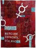
You can read more about the quilt and the story behind it on my website by clicking here The final quilt of 2016 - finished at last
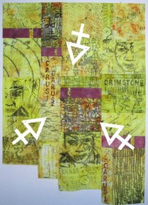
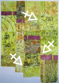
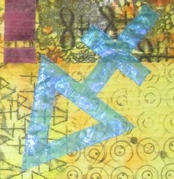
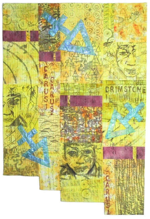
With all the fabrics for the 'Carusi' quilt now pieced together it didn't take long to quilt it. As I am completing all the quilts in the series using the same basic fabrication techniques I didn't need to spend time planning for the quilting design. What did need some thought, however, was the positioning of the sulfur symbol motifs once the quilting was complete. As they are a very distinctive shape, having that great big pointed arrow-like triangle, it was very important to get them in the right positions. Any pointed shape has a big impact on taking your eye around a quilt, and the last thing I want to do is send the viewers eye right off the quilt or to an unwanted focal point. Take a look at the 3 pictures below to see what I mean............
To help me decide I cut out a few shapes from paper and played around with positioning the pieces on the design wall. I had a rough idea of where they should go, but getting the position and angle of each one just right needed some twiddling. By just pinning them onto the quilt on the design wall then standing back made it easy to see exactly where they should go.
That done, the last thing to be decided was the colour I should make the sulfur symbols. As the symbols are part of the story the quilt tells it is important that the colour I used supports that story but also looks good with the rest of the colours in the piece. For 'Chrysopoeia' I chose to use gold leaf on a generally dark blue ground; for 'Dragon's Blood' I used silver leaf on the red ground - but for sulfur I had to think. I decided to use a vibrant blue-green mixture of fused angelina fibres, the colour of the flame created by burning sulfur.
Overall I am very pleased with this quilt and I feel the series is developing well. If you have any thoughts about it I'd love to hear from you. The first quilt for 2017 - getting started
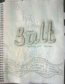
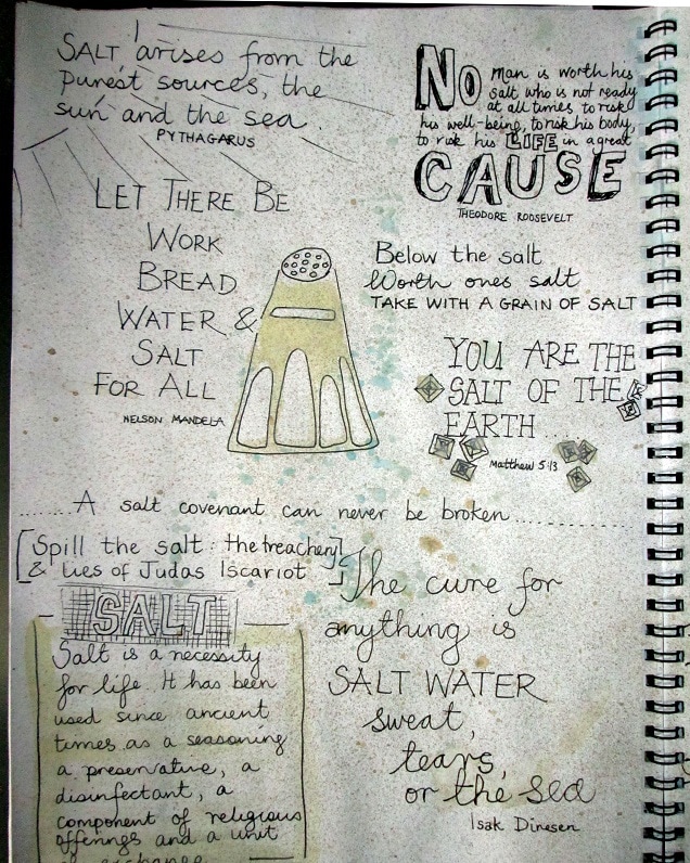
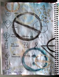
And so on to the next piece in the series which will complete the 'Tria Prima' - and will therefore be about salt. Here is a sneeky peek of a my first few salty sketchbook pages, and once again my research has led me to find out something of which I was unaware ......
Thanks for reading.
Comments are closed.
|

|