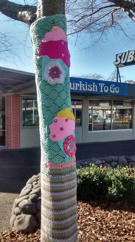
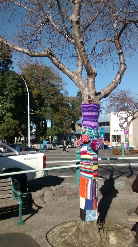
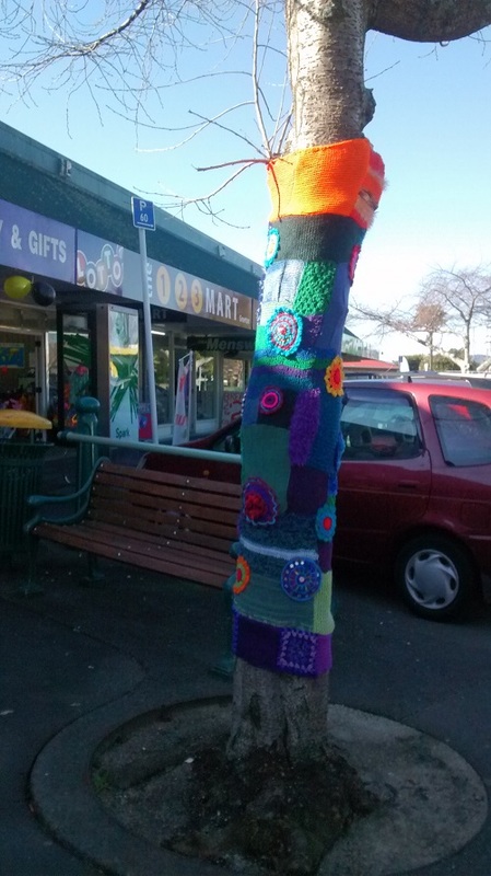
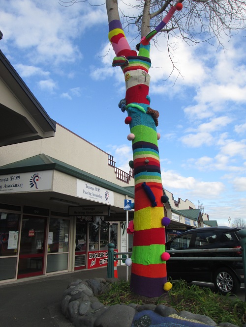
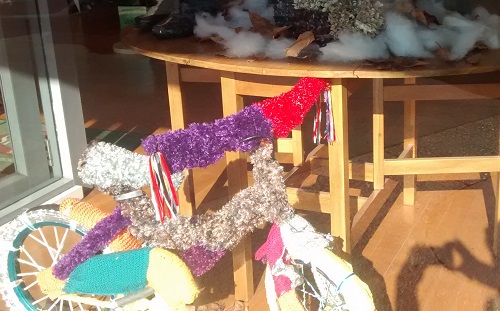
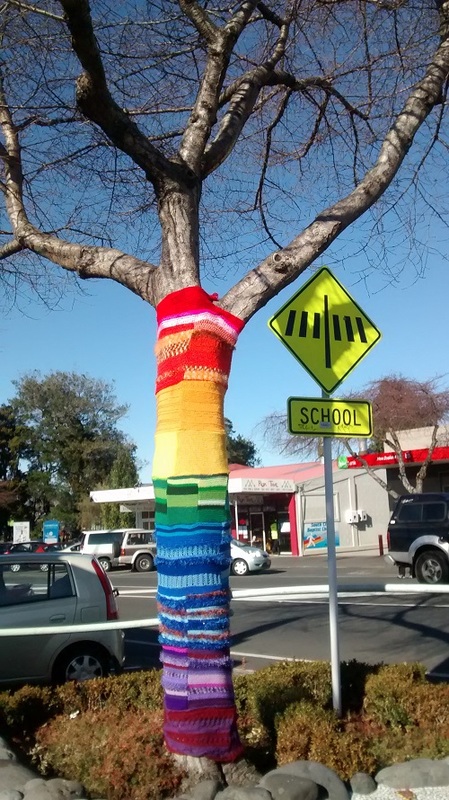
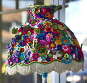
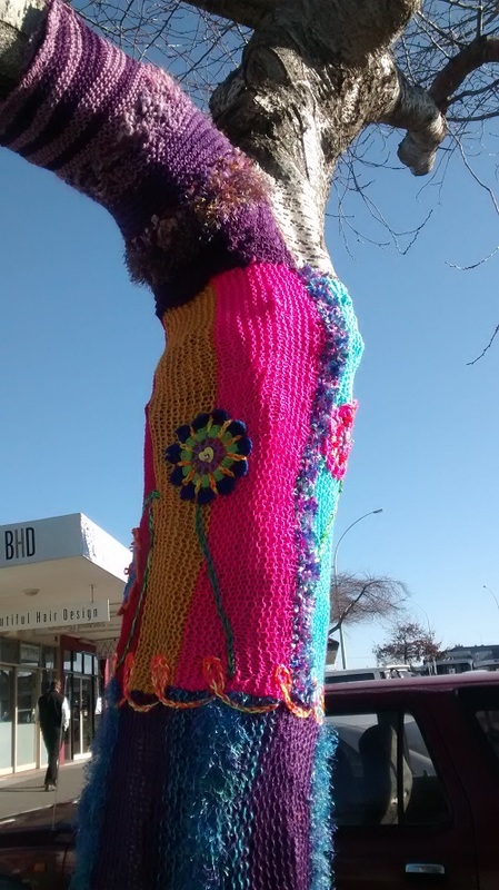
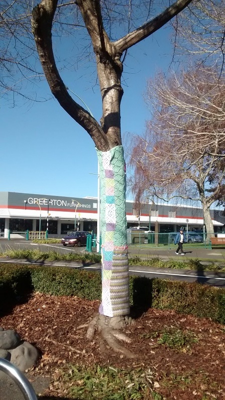
I had a lovely surprise when I went to the local shops this weekend - an explosion of colour had appeared, brightening up the bare winter trees along the sides of the road. As I took lots of photographs to add to my colour resource, a lady popped out from one of the shops and asked me what I thought. We chatted for ages and it turned out that she was the co-ordinator of the whole yarn bombing project! Her name is Liz Roris and although she has co-ordinated this fabulous local art project her main passion is mosaic work. More on that later.....
The village is called Greerton and is in the city of Tauranga on the North Island of New Zealand. It has been my temporary home for the past 2 months. It looks fun, doesn't it?
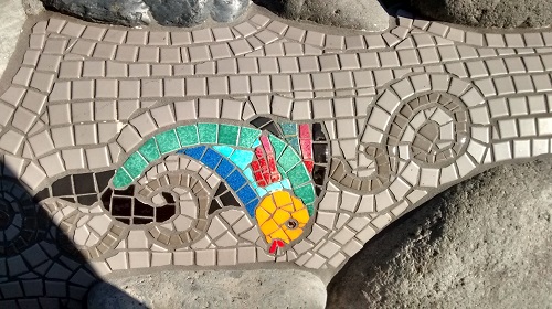
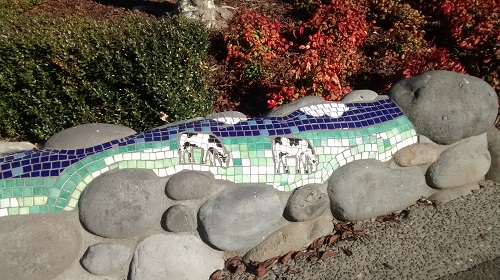
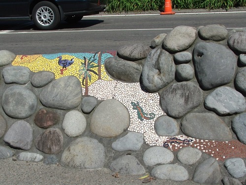
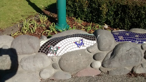
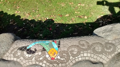
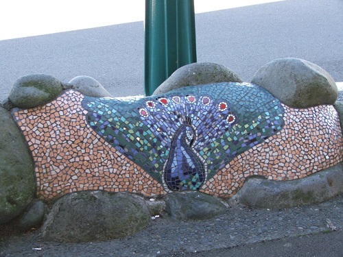
Liz Roris is a well known mosaic artist here in New Zealand. You can find out more about her work here.
Her work can be seen in several places around Tauranga, but the artwork which I have been seeing these past 2 months is on low little walls and borders all around Greerton village. Here are a few more pictures for you to enjoy. I must say, Greerton is one colourful place!
Thanks for reading - I will be back to quilting soon- I've missed it! - and I may even see you at the Somerset County Quilters meeting or at Festival of Quilts in Birmingham. I will be on the Contemporary Quilt Group challenge stand along with the fabulous quilts from the 'elements' challenge.
As you know, I like to collect beautiful images - not only as inspiration for new projects, but also to help me with choosing and using colour. If I find a picture I like I often ask myself why. What is it about the image that pulls me in? Sometimes it is just the subject matter. Who could resist Petr Kratochvil's picture of this cute-as-can-be piglet? (I have a very soft spot for pigs)
I found this image on the Wikimedia commons website; remember it is the website where anyone can find millions of freely shared images (and are more often than not copyright free - but do check). https://commons.wikimedia.org/wiki/File:Cute_Piglet.jpg Other times it may be an image that captures a beautiful pattern or texture. The photo above right is one I took of the beautiful forged ironwork on the central doors of the main entrance to Notre Dame Cathedral in Paris.
But the most useful images I find and use are images that appeal to me because of the combination of colours they contain. If I like an image because of its colour (amongst other things), it is really useful to isolate some of those colours with a view to creating a colour palette I will also like.
Take a look at one of the photos from the collection I made last week: The Bo Kaap district in CapeTown is a riot of colourful buildings. Just by looking carefully at this photo I was able to pull out lots of colours that look beautiful together. It isn't difficult to do and can be done in a number of ways. Here are a few I like to use:
Using water colours
Stick the image you have chosen onto a white page. This one is a page from my colour resource sketchbook. I then use my water colour paints ( but you could use any paint) to try to match colours from the image as closely as I can. When I think I have the exact shade / tint or tone/ I paint a small blob on the edge of the picture. I also try to remember to record how I made the colour for future reference.
This has 3 benefits:
Here is another photo I used along with my water colours. I really this activity, and have a nice collection of potential palettes that would make beautiful quilts. Using computer software to select colours
Another really easy way to identify some beautiful colour combinations is to open a picture in image software. I opened my photograph of a gorgeous little puffin using Microsoft Paint. It is such a simple piece of software - but is perfect for this job. All I do is make some empty boxes to the side of the picture, then use that little colour selector pipette tool I spoke about a few weeks ago to suck up colour from various points on the picture. I then use that colour to fill in one of the boxes with the bucket fill tool. And this is what I ended up with - a vibrant colour selection that would make a knockout quilt!
Using scissors and glue
The simplest way of all is simply to cut out little pieces from the image you have chosen (although this spoils your lovely image - but it may be a price worth paying). Although this method is super quick it doesn't actually get you to think all that much about the colours you have identified. It is probably better used as a good starting point - use the small pieces you cut out to work on later to match with paint or fabric or any other means you like. Just remember - the more you think about colour, the better you will understand it.
Thanks for reading! This week, after a long break, I am hoping to get down to creating something with fabric again - it has been too long since I did that! I have been busy with lots of things for the last few months - so I am hoping I have not forgotten what to do! I will post some pictures of what I get up to - I have found an interesting new product - so will let you know if it works out! If it does, I might bring some back to the UK with me!!
Sometimes it is nice to do something just for the sheer pleasure of it don't you think?. I have just spent a very enjoyable afternoon going through a pile of magazines I found at a market for a few dollars. They were old travel magazines - and I love them. Seeing beautiful images of far away places through photographs taken by great photographers is always a pleasure for me - and often gives me a whole new set of ideas to think about.
The bonus of this is that the images are often filled with beautiful colour. Take a look at this image below of the entrance to Badshahi Mosque in Lahore - isn't it spectacular? I doubt I will ever see it with my own eyes - but I guess this is the next best thing. I can imagine making a piece of work with such beautiful and rich colours.
Those of you who know me probably know I like to keep a art journals and scrapbooks. One is full of images such as this - to refer to when I need some colour inspiration. Since I am thinking a lot about colour at the moment I thought I would share a small selection of my current favourite images, and try to inspire you to start a collection of your own. All you need is a cheap scrapbook, a glue stick and a pair of scissors - oh, and some spare time, (possibly the most scarce resource of all!)
Note: If you can't find any old magazines (the supermarket free magazines are a good place to start - I particularly like the Waitrose magazine that is free if you have a Waitrose card), then take a look at the Wikimedia Commons website. It is a website crammed full of images that are free of copyright to use (read the small print for each image to see any terms and conditions). Here is a link......... https://commons.wikimedia.org/wiki/Main_Page
Go on - find some nice images and start cutting and sticking!
Next week: How to create colour palettes from beautiful images such as these. Thanks for reading.
|
|