|
I have made several quilts on the theme of Freedom and Liberty over the past few years and have just completed another for the group 12 by the Dozen. I didn't set out with that intention, but this recurring theme emerged from my research into the work of the textile artist Jean Lurçat. (Find out more about Lurçat and his work here.) Initially I was not drawn to his work at all - at first glance it appeared to me to be chaotic and confusing - too much to take in. But after some (slow) research I began understand what I saw now I like it very much.
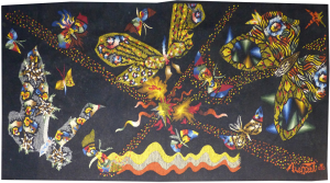
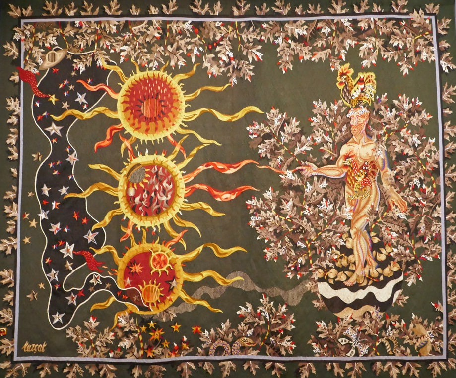
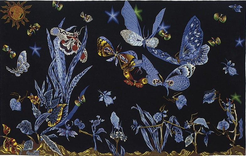
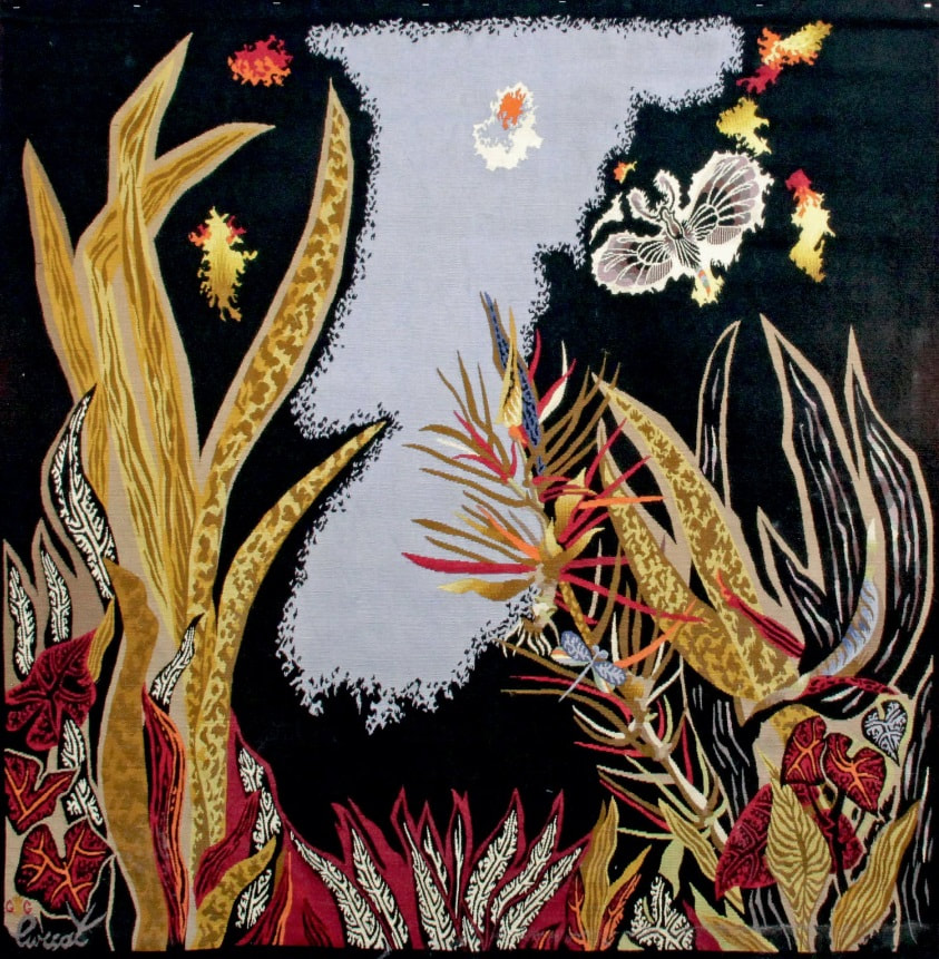
Here is a very small selection of some of his tapestries to give you a flavour of his work ...
I have also created a Pinterest board with lots more of Lurçat's work, including his paintings and ceramics. Click here to see the board.
If, like me, you are new to Lurçat's work, one of the first things to know is that much of his work is in tapestry, a somewhat unconventional medium in modern times.
From Medieval times, and up until around the end of the 15th Century, the artistry of tapestry was highly prized. Enormous tapestries graced the walls of great buildings, forming part of the architecture they decorated. They served to keep the place warm as well as conveying messages and having their own decorative features. However, from the 16th Century and the beginnings of the Renaissence, painting and sculpture pushed out other forms of art and tapestry came to be regarded as somewhat 'oldschool'. If tapestry was to survive it needed to look more like a painting than a traditional tapestry, The result was that in 1773 the French state run Gobelins weaving works raised the dye palette of wool for tapestry from 20 (twenty) to an incredible 14,400 possible tones. Hence, the cost of producing wool in this many variations went through the roof and Gobelins reached the point where they were having to dye 1,456 pounds of wool swatch to get 44 pounds of tapestry. It was untennable; the upshot of this was that the price of creating a tapestry (that wasn't exactly on trend anyway) became impossibly huge and largescale tapestry production all but stopped.
.................***********************....................
In around 1915 Jean Lurçat began exploring his art. One of the pieces of art that captivated him was the incredible piece of Medieval art known as The Apocalypse Tapestry (click here to find out more). It was this set of tapestries which set him on the path to becoming one of the modern day artists (along with William Morris) aclaimed for their role in the revival of contemporary tapestry. 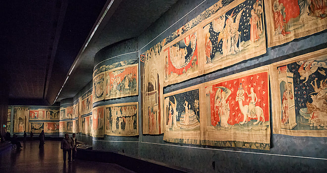
The Apocalypse Tapestry, commissioned by the French King, Louis I, and produced between 1377 and 1382. 90 scenes depict the story of the Apocalypse from the Book of Revelation by Saint John the Divine. (Wikimedia commons)
The issue of producing so many different colours to create tapestries led Lurçat to conclude "you do not get the subtleties of Bonnard even with 14,400 tones (of wool)" After much thought he set about devising a tapestry colour palette using a "scale of pre-arranged colour" that would hopefully bring tapestry creation back into the realms of feasability. His success in this quest means that all tapestry now, more or less, follows Lurçat's system of limitation of colours. He used just 5 shades each of red, blue, grey and ochre, four shades of green and six of yellow plus one black and one white, making thirty-two in all; quite a difference from 14,400! 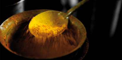
Yellow pigment used to dye wool at the the Cité Internationale de la tapisserie in Aubusson, France. Click on the picture to see a short video clip created by the museum
To satisfy my own curiosity, I decided to make a colour study of my own using Lurçat's work. By looking closely at his work I was able to see how cleverly he used colour to make his work almost 'glow'. I then used it to create my own collction of fabrics using what I discovered. 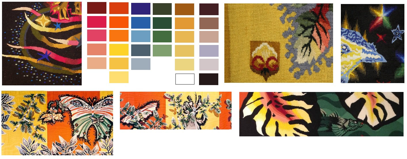
Colour Study using a small sample of Jean Lurçat's tapestries
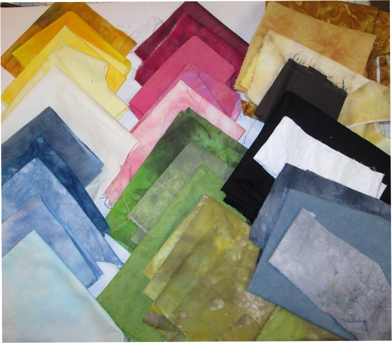
My hand dyed fabric selection based on Lurçat's choices
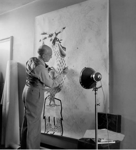
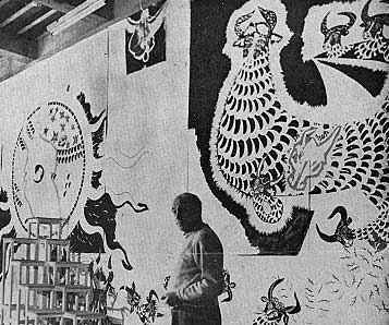
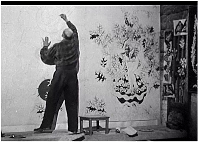
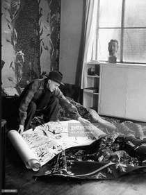
Lurçat's Design Process Whilst researching Lurçat's work online I also came across a few images of him designing his enormous tapestries at his atelier. Like many people I find it very interesting to see an artist's process. It also helped me to understand the scale of his work.
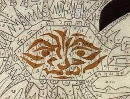
Closeup showing the 'carton' given to the weaver, identifying the shape and colours of the wool that was to be woven
A few other interesting facts: The weaver of Lurçat's designs (he was not a maker himself) had to follow strict design guidelines and was to have absolutely no artistic freedom in the creation of the piece. Once Lurçat presented his design, the 'carton' (translated into English as 'cartoon' which is the drawn 'pattern' ) was to be faithfully recreated to achieve exactly what Lurçat had envisioned as the end a result. In essence, it was a non-interpretive code in which the weaver would have no question as to what the designer required. Additionally, Lurçat mades it very clear that the idea of fashioning a tapestry after a painting, especially one that had originally been painted with no intention of becoming a tapestry, was misrepresentative and disrespectful to the art form. (He would probably, therefore, not be happy about what I did next!) Lastly, he was adamant that each tapestry should be embedded with content; it should thrive as a partner to architecture and therefore be invariably large scale and designed and thought of as being forever connected to the architecture it was designed for. "I want to remind you that Tapestry knew its proudest moments in a time when a style of extremely grandiose architecture reigned supreme".
.................***************..................
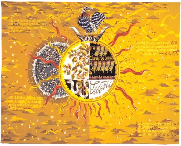
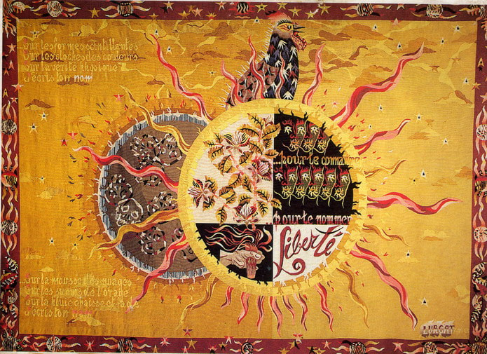
For my small quilt (sorry M. Lurçat) I chose several recurring motifs from his work: the sun medallion, butterflies and cockerel. Many of his artworks, tapestries as well as his pottery, have variations of these motifs deeply embedded into their narative. More specifically I was attracted to two of his works that focus on the theme of Liberty: one he created in 1943 and the second in 1948 (see below). They were his response to a poem of the same name, written by another famous French artist, Paul Eluard, (You can read the poem in English and French here.) 
Liberte: Jean Lurcet, 1943

Liberte: Jean Lurcet 1948
I am sure it is a coincidence, but this unusually vibrant yellow colour is very similar to that which I used in my two previous quilts focussing on Liberty - perhaps that is what made me notice them? I find these two tapestries striking - so much so I wanted to recreate my own 'Liberty' piece along similar lines. Using fused applique pices from the fabric selection I made earlier I created a medallion motif and sectioned it in a similar way to Lurçat. 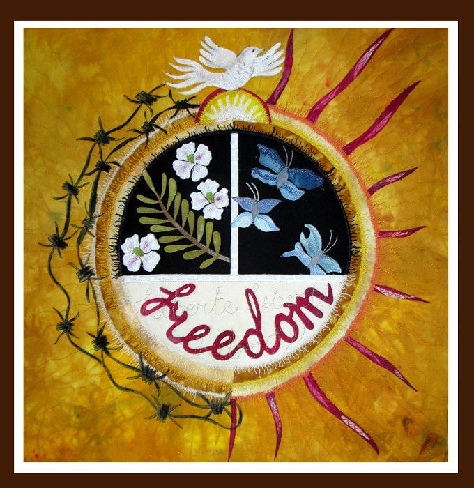
'Freedom', after Jean Lurçat by Claire Passmore 2018
This is my interpretation of Lurçat's 'Liberte'; my newest version of 'Freedom' using motifs familiar to dwellers of the 21st century: White poppies symbolising pacifism, an olive brach of peace and butterflies, free to go where they choose. The sun's rays represent optimism for a brighter future, but the barbed wire, still lingering, is ready to spread its pain. And at the top, instead of Lurçat's French Cockerel I have placed a dove, flying high over a rising sun. It is a bit of a different quilt for me - but I have really enjoyed finding out more about this quite different artist and trying something new. I feel it may be the beginning of something. I'm not quite sure what yet, but time will tell. As a final thought, earlier this summer I was very kindly taken by my friend Liz to the Grayson Perry exhibition in Bristol. He too is working in tapestry on a grand scale, telling contemporary stories. Whilst I thought they were impressive, they did not have a great effect on me at the time. It is only now I am seeing them from a new perspective. Thanks for reading.
|

|