Following on from my last blog, this is the second of my 16 inch square quilts made in my 'Works inspired by artists' series for the group '12 by the Dozen'. This time the artist chosen was Wilhelmina Barnes Graham, chosen by Linda Bilsborrow, and what a great choice it was. You can find out more about her by clicking here.
Below is a tiny taste of her work.
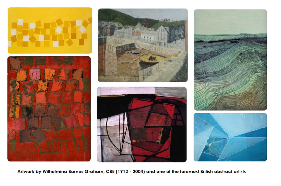
The inspiration for this next quilt comes from my study of her drawings, and in particular, her 'Line' series. One of my favourites is titled 'Music of the Sea' which you can see by clicking here. I find the simplicity of this work fascinating. Simply by the repeated use of hundreds of thin lines Barnes-Graham was able to capture enormous energy and movement in her drawings and is a perfect example of 'rhythm' in design terms. That is what I wanted to explore.
As I wanted to create a portrait again I chose a sketch I made several years ago of a man I once knew named Paul.
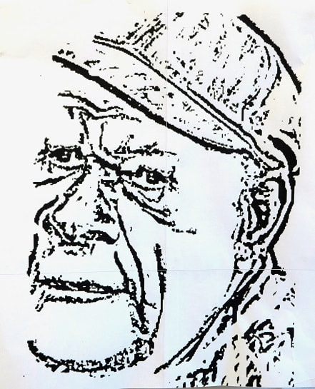
 Taking this drawing as a starting point I drew several new versions of Paul's face, concentrating on using only thin lines to mark the contours of the face. The progression below shows what I did. I deliberately did not use as many lines as Barnes-Graham as I wanted to leave space to add more lines with the quilting stitches later. I must say, it does remind me of a map! Once I was happy with the drawing I made a series of mono prints by reversing the image and drawing onto the back of a piece of white cotton fabric that was laid onto a sheet of glass covered in oil based printing ink. It is a technique I love to use and have described several times in the past. (Click here for a recent blog post describing the technique)
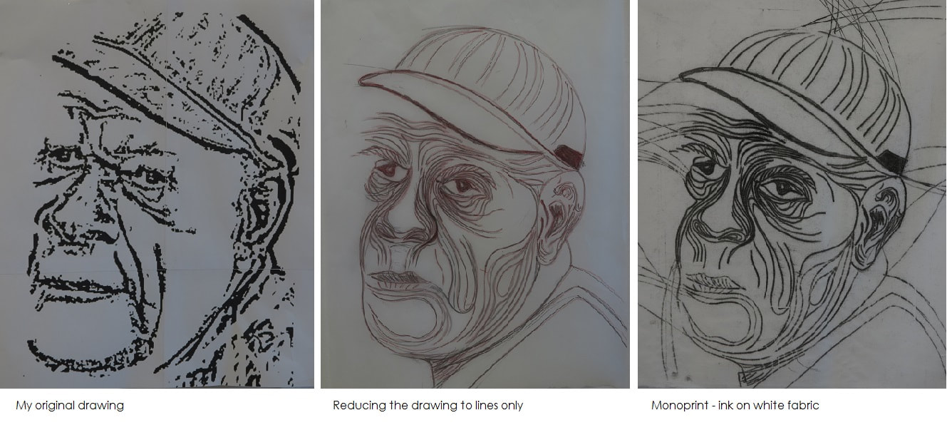
As I had a lot of ink on the plate I decided to make several prints. One of the early prints was especially dark and the lines lost much of their definition (too much wet ink on the printing plate) so I ended up turning the fabric over and using the back of the print which was much more subtle.
Once the ink was fully dry (about 4 days) I used Markal oilsticks and a dry toothbrush to add hints of colour to the fabric. I used turquoise, Wedgewood blue and muddy grey colours, similar to those Barnes-Graham used in 'Sea Movement' (see image below; click here for more details of this piece) Once it was dry (another few days) I free motion quilted further thin lines with black thread, echoing and enhancing the lines already in the drawing .
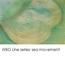
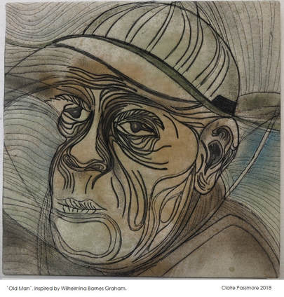
He looks quite a sombre old man, don't you think? I am not entirely happy with the bottom left corner of the piece, I think I got it wrong when I added that diagonal line coming up from his chin area. I also don't like the dark grey shading I added in the very bottom left corner, continuing from his jersey. In an attempt to understand better what I had done I decided to make a second piece to address the problems, which you can see below.
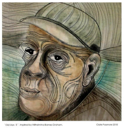
It is mostly similar, but the colours are a little more vibtant, the lines thinner and less dark and the bottom left corner has been tidied up, I think it is a much better version - and he doesn't look so glum either.
I am happy to say that 'Old Man II' is currently on his way to New Zealand (via South Africa) to be part of an exhibition by members of '12 by the Dozen' at the National Quilt Symposium in Auckland, 1st to 6th October 2019. Further details can be found by clicking here. Many thanks to Rosemary Rush for organising this fabulous opportunity for us. For my next blog post I will share the third and latest quilt I have made, inspired by the work of German artist, Gabrielle Münter, chosen by Uta Lenk. Thanks for reading.
One week on and this is the progress I have made. It took a lot of thinking about how I want the finished quilts to look. The last group of faces I made were mostly colourless, or very lightly coloured. For these quilts I decided I want to add a new dimension, and colour is going to be my focus.
Over this past week I have spent a lot of time trying different colour palettes; from realistic to complete fantasy. The image above is what I have decided to go for. It is interesting that in this photo they left eye does not work well, yet when I look at the quilt top it seems fine. I need to find out what is going on, and if necessary make some changes.
I have never really painted a large face with colour before, and I knew I would need to mix a lot of different tints and values so I could give contour and definition to the face . As you can see, the style I have chosen is not exactly 'realistic'.
This is what I did.
Like your art teacher probably used to tell you - start with primary colours.
The paints I used are Daler Rowney Graduate acrylic paints mixed with a little Berol fabric medium. Nothing fancy, but not the budget type of acrylic either. I started with Primary red, blue and yellow. I also used mixing white a bit later. (I didn't use the brown that is in the photo at all.) I used these 3 colours to create a base colour from which I made all the other tints. I began by mixing equal quantities of each colour, but ended up with a sludgy grey yuk. After some trial and error I ended up using 2 parts yellow, 1 part red and 2/3 part blue to yield a dark brownish yuk. I made a small jar of this to use as my base.
This is the yuk that turned out to be perfect when mixed with various amounts of white.
I made a (not terribly accurate) record of my mixing in my sketchbook, as you can see below. Using just the dark yuk to start, by adding small amounts of white, red, yellow or blue as I worked I was able to paint each part of the face with different values and tints. I also took a photograph of my own face to use as a value reference which proved to be very helpful. This is how my paint palette looked at the end of the day.
I had intended taking lots of photos as I worked, but unfortunately I got so engrossed with it all that this is the only photo I took before it was finished. You can see form this image I started by adding the lightest values around the eyes first.
And this is how both faces look now. And now the project continues - next stage - how shall I quilt them????? Thanks for reading.
And so I finally got there. I have been thinking about this for so long now it seems like it is an old idea, but this week I have finally got it 'out'. The beginnings of a piece of work on copper, element 29. It is that shiny, reddish metal that was probably the first ever metal to be worked my man.
The oldest metal object found to date in the Middle East consists of a tiny copper awl dating to around 5100 B.C. The artifact was unearthed in Tel Tsaf, an archaeological site in Israel located near the Jordan River and Israel's border with Jordan. In my research into this common place metal I have learned some very interesting things......
Anyway, with this and more buzzing around inside my head I got out my sketchbook and started to mess about. Here are a few of the pages:
Although copper does not readily corrode as much as iron, its surface does oxidise when exposed to air. The oxide layer, unlike rust on iron which flakes off, remains on the surface of the copper in a beautiful green layer known as verdigris. This is the colour I decided to dye the fabric for the copper quilt.
The best verdigris colours came from a recipe using turquoise, bright blue and golden yellow procion dyes. The rest of the greens will probably end up being overdyed again transformed into something for another quilt about lead!
Using some of the symbols from my sketchbook pages I made some print blocks from foam and lino and printed onto the green fabrics. I also used a monoprinting technique to create other thin lines and marks, all which have some connection with copper. You can see some of the results below. The fabrics have been cut into strips and pieced in a similar way as the other alchemy quilts I have made.
And these are two long strips I have stitched together, alongside the original quilt which was the first in the series which has just returned from a trip to China (I wish I could have accompanied it!).
As for what comes next, I am not sure. I obviously want to add stitch - I have some thin copper wire I would like to try - and I am also thinking about using copper leaf and copper shim, but as to how - that remains to be seen. I think some experimenting is in order!
Thanks for reading.
Autumn has arrived here in New Zealand, and it is beautiful. This is the tree just outside our house; I don't think I have ever seen such vibrantly coloured leaves.
Walking among the fallen leaves, I can't resist picking up handfuls and throwing them in the air then watching them tumble down like confetti.
Just for fun I decided to collect some of the most brightly coloured specimens and spend the day playing around with them. These are just a few pictures. First I just spent time looking at them closely, arranging them in different ways. I took photos and played around, creating layers using GIMP - the free version of Photoshop. It is so easy to experiment in ways that would be so difficult to do without such software.
Shifting colours
Then I moved on to working in a sketchbook with acrylic paint, a fine black pen and a craft knife
And finally I stitched a few bundles of leaves together. Whilst they are soft and supple it wasn't too difficult. They are now under a heavy weight to try and keep them flat whilst they dry out. I have no idea what will happen to them!
I have no plans for any of this,but sometimes it is nice to do something for no good reason!
Thanks for reading.
I've been working on a new quilt for a while now, for the SAQA 'Made in Europe II' exhibition. I am hoping it will be selected to hang in their gallery at Festival of Quilts later this year. It isn't what you would call a 'pretty' quilt, but it is part of the ongoing work I have made this year in terms of its style and inspiration.
The quilt itself is of fairly simple construction, (much like the others) being made from irregularly sized rectangles pieced together, so nothing much to write home about there. The fun in this quilt has come from creating a particular effect on the fabric I used. I was aiming for a very specific visual texture, the look of iron metal that has been painted and then blistered by rust beneath the surface. The process of creating it was an interesting journey, so I thought I would share a little of the process I used to create it.
I decided to start with a large piece of commercially dyed black homespun fabric and then remove some of the colour from it. In the past I have used both formusol and discharge paste to remove colour from fabrics, but neither was readily available to me here, so I got out the bleach did some experimenting to find the best way to get the results I had in mind. As it turns out, it worked brilliantly - so much so, I may never bother with the smelly formusol ever again!
Interestingly enough, here in New Zealand bleach is comparatively expensive. I have no idea why! In the UK it is dirt cheap. I sought out the least expensive bleach I could find - it turned out to be the thin watery stuff - and tried various ways to thicken it so it would be more controllable.
I started with manutex - the sodium alginate seaweed based thickener I usually use with dye: Sadly it was no good. The bleach completely destroyed the viscosity. Dharma Trading sell a thickener for bleach made by Jacquard (click here to go to their website), but I would have had to import it from the USA and I didn't want to wait for it to arrive, so my search continued. I found out about fumed silica (click here to find out about this interesting stuff) which would apparently work very well (maybe that is what is in the Jacquard stuff??), but again I would have to order it. So I decided to try plain old starch - cornflour in water. I mixed two big spoonfuls of cornflour into a little cold water to make a slurry then added another half a cup or so of water and and popped it into the microwave. A few seconds later I had a very thick, gooey transparent paste. I mixed in some thin bleach and gave it all a good stir. It stayed thick and allowed me to draw, dribble and stamp the bleachy paste onto the black fabric. For a cheap and practical solution to my needs the cornflour paste was perfect! Note: Interestingly, the left over bleachy paste did break down overnight and became thin and runny - so I recommend mixing the the bleach and paste as you need it rather than making a big batch. There is some debate as to how much damage bleach does to fabric when used to remove colour (discharge) in this way. To be honest, I have used bleach to remove colour several times in the past, and never had any problems. The fabrics still seem to be in good condition and I see no problems on the horizon. Maybe in 20 or more years there will be - but so far so good. However, in the interest of being thorough I researched how to neutralise the bleach and stop any potential damage. There are a number of methods various people recommend. The one NOT to do is to dip the discharged fabric into a mixture of vinegar and water. The (faulty) logic goes like this: bleach is alkaline, so neutralise it with an acid. Apparently it is not quite as straightforward as it seems (is anything???) Paula Birch has a very good explanation of the different methods on her website, which you can find here: www.pburch.net/dyeing/FAQ/neutralizingdischarge.shtml I opted for the hydrogen peroxide as it was the cheapest and easiest to obtain, not to mention that it seems less noxious. Paula Birch recommends 3% peroxide, which translates to 10 vol if you are more used to that measurement. (As a long term experiment I have kept 3 pieces of the discharged black fabric. One has not been neutralised at all, just rinsed in water, the second has been neutralised in the dreaded diluted vinegar and the third in peroxide. Time will tell if there is any difference!)
By this stage I was pretty happy with the effect. To me it is beginning to resemble a section of painted iron. I have since added some further fabric and begun the process of hand stitching various knots over the surface to give it even more texture.
The closing date for entries to the 'Made in Europe II' SAQA exhibition is 31st May - so I had better get on with it! http://saqacallforentrymadeineurope2.com/ Thanks for reading.
I'll use them to dye some fabric.
To make the dye I started with about half a bucket full of dried flowers and added just enough cold water to cover them. They were very buoyant and I had to squish them down to get them to start absorbing the water. I left the bucket out in the sun all day to stew. The next day I let the sun warm it all up again then squished the whole lot though an old sieve. The flowers had completely broken down into a silky mush, but the water had taken on an incredibly dark red wine colour.
Before I added the fabric I decided to mordant it in the hope that I would get a better result. I didn't want to use anything toxic, so I chose to use vinegar. All I did was make a mixture of water and vinegar (1 part vinegar to 4 parts water) and simmer the white fabric in it for an hour. After 1 hour I left the fabric to cool in the solution and then squeezed it out ready to dye. If I had been scientific I would have tried a mordanted piece of fabric and a non mordanted piece to see the difference - but if I'm completely honest - I forgot.
As I had a lot of dye liquid I decided to see whether simmering the fabric in the dye would give a darker colour than simply leaving the fabric to soak in the in the sun. I cut the the squeezed out fabric into two and put one into my dye saucepan and simmered it for an hour then left it to cool overnight. The second piece I just put into the dye bucket and left it out in the sun.
The next day both pieces looked exactly the same. Finally I put them both into the washing machine and washed them in cold water with a little delicate washing liquid.
The photo above shows how the two pieces of fabric turned out. They are both almost identical (so there was no need to use any electricity to simmer the fabric at the end - and quite possibly I could have done without simmering the vinegar either - something to explore in the future) and have a very pretty pale pink with a hint of greyness. I suppose I could call it mink. I still have a piece of avocado dyed fabric from last year so I have included that in the photo too (on the right). That has a similar colour but has a little more brown in the pink. It actually goes very nicely with the hibiscus dyed fabric. (You can read the post about dyeing with avocado pits and skins by clicking here and here.
As delicate as the fabric is I think it needs a bit of a kick to create something a little more interesting - so I mixed up some procion to dye some more smaller pieces of fabric to co-ordinate. I used fuscia, golden yellow, charcoal, pewter, my current favourite, cobalt. And this is what I now have - I think it look great.
Thanks for reading.
One week on and here it is - the finished quilt 'Dragon's Blood'.
I don't think I have ever made a quilt so quickly and enjoyed the process so much. The hardest thing about the whole project was choosing the title! It is my entry to the SAQA challenge 'Made in Europe'. (Dragon's Blood was the name often given to red pigments by the Romans - no matter what their source!) I am so pleased with how well it came together. As most of the preparatory work had already been done in my sketchbook it was just a matter of cutting the fabrics and playing about with them on the design wall to work out the best arrangement of textures and colours. The other thing I am really pleased with is the cotton sateen fabric. The photograph doesn't show nearly how beautiful this fabric looks. It is the first time I have worked it and I am completely in love. The cloth is soft and easy to stitch, yet firm enough not to stretch or distort and has the most delicious sheen. I wish I had started using it years ago!
I mentioned in the last blog post that it is a follow-on piece from a quilt I made a few year ago, called Chrysopoeia. Now 'Dragon's Blood' is finished I can show you them both together.
The large silver symbol on the new quilt is one of the many symbols used to represent Mercury - both the planet and the rather unusual silver-skinned metal. (I have always been fascinated by the symbols the Alchemists used to represent the chemicals they knew of). Mercury is a relatively rare metal, whose use has long been irreplaceable in a variety of technical, chemical and industrial processes. It has only ever been produced in substantial quantities by a small number of mines worldwide, the largest of which is in Almadén, Spain. Almedén has the largest reservoirs of cinnabar (the ore which yields mercury) in the world and in 1937 60% of the world's mercury came from its mines. Competition from China means that the mines are now closed, but Almadén has become a World Heritage site on the strength of its past. As well as being the major source of metallic mercury, cinnabar has another use. When ground into a fine powder it makes the intense red pigment known as vermillion and was embraced by artists during the Renaissance. True vermilion isn't a uniform shade, as it varies from a brilliant orange-red to a duller, bluer red, depending on the consistency of the cinnabar grounds — the finer the powder, the more brilliant the hue. With this in mind I decided to use fully saturated shades of red for most of the quilt, even though I knew that would make it pretty intense!
As I continued to work of the design of the quilt I made the decision to continue to using Alchemists symbols as marks on the fabric. I chose the following as the main symbols and made the marks using the mono print technique with black and silver textile ink.
For the final part of the design of the quilt I wanted to incorporate something of the story of Alexander Calder's mercury fountain. Calder was commissioned by the Spanish Republican Government to create a piece for the 1937 World Exhibition in Paris. Although highly toxic, Calder chose to use mercury to create a kinetic sculpture to welcome visitors to the Spanish Pavilion. The mercury in his fountain had a double significance: acting as the driving force of the piece, and also paying tribute to the people of Almadén who suffered greatly at the hands of Franco's fascist troops during the Spanish Civil War. Among other works, the World Fair Spanish pavilion also contained Picasso's iconic painting Guernica and Miro's painting 'The Reaper'.
'Mercure Espagnol D'Almadén'
After the exhibition Calder donated the Mercury Fountain to the Fundació Joan Miró in Barcelona, as a mark of his friendship with Miró. It is now displayed behind very thick permanently sealed glass to ensure the poisonous mercury vapors never escape. So, that is this quilt finished, and for my next one..............sulphur. You can probably guess - it is going to be yellow! Thanks for reading.
I am in the process of making a new quilt for an exhibition named 'Made in Europe'. I must admit, I found the topic quite difficult to interpret. After a lot of thought I decided to revisit the subject of land art - the way man has intentionally shaped the landscape. Living in Wiltshire means I am surrounded by it; the Wiltshire White Horses, Stone Circles, Henges and Burial mounds are everywhere, so I have no shortage of inspiration.
I began my quilt by dyeing a beautiful piece of white cotton sateen; I got quite carried away and ended up flooding the kitchen floor with dye so I could get the effect I was looking for. (In hindsight, I think I should have bought something like a kids paddling pool and used that to contain the lake of dye) What I wanted was a green landscape background with lots of swirling movement created with red/brown curved bands radiating around a central circle. Happily, the fabric turned out just as I had hoped and I began work on the next step - adding the henge circle and white horses. Everything was going well and I was very pleased with the progress of the quilt, until I hit an issue. The exhibition has specific requirements in terms of the finished dimensions of the quilt, and although I was mindful of this at the outset, I deliberately decided to create the quilt larger than required and then crop it down later on in the making process. In the past I have regretted not making a quilt larger, so I thought this would be a good idea. Unfortunately once I had the horses completed I pinned the quilt onto my design wall, stood back and took a long look at it. Straight away I knew that I didn't want to cut it down in size. The rhythm and circular movement of the design would have been ruined if I cut 20cm off of each side. Damn. So it was decision time. Cut the quilt and compromise the design, or put it to one side to finish another time and make something else.
I decided on the latter.
Which means I need to get on with a new quilt pretty sharpish as I have just under 3 weeks to get it completely finished! I briefly thought about recreating the same quilt, but smaller; but really, what is the point in that? So instead I got out my sketchbooks and started to develop an idea I worked on a few years ago when I made the quilt called 'Chrysopoeia'. That quilt was about Alchemy and the mysterious creation of gold. You can see more about that quilt here: http://www.clairepassmore.com/contemporary-quilt-challenge-2015-elements.html The new quilt is going to use the research and imagary of another metal that was important to the ancient alchemists - this time Mercury. Here are two mercurial pages from my old sketchbook. The largest natural source of mercury is the beautiful reddish mineral known as cinnabar, and the richest deposits in the world are found in Spain and Italy. Cinnabar is composed of mercury and sulfur and as well as being the primary source of metallic mercury it has also been used as a pigment since ancient times - the pigment being known as Vermilion. It is vermilion that is to be the subject of my new quilt. Find out more fascinating information about Mercury here and vermilion here For a quilt about vermilion I obviously need red fabric - and as true vermilion pigment is not just one specific hue (as it is made from finely ground cinnabar which contains all kinds of impurities) the pigment you obtain varies from orange-red through to a blue/grey-red. That meant I needed lots of different reds. So I got out more of my lovely cotton sateen and started dyeing again (no puddles this time!) Once rinsed and pressed I moved on to adding marks using one of my favourite techniques - monoprinting. I know............... this is blue fabric. I need a little contrast too! A 100% intensely red quilt may well just be too much! And here are a few examples of how the fabrics are presently looking. So, now I am off to begin piecing all my lovely fabrics together. So far..... so good! Thanks for reading. p.s. just in case you didn't notice, I have changed my website address. It is now plain and simple: www.clairepassmore.com but if you use the old one, you will still be redirected here.
It was another glorious autumn day today, and although I had lots of things I needed to stitch I just couldn't stay inside - so took a few hours and drove into the Kaimai Mountains to enjoy the spectacular colours on show.
The colour of all the trees around the lake was incredibly vivid, but on the shaded valley sides the tree ferns were very different; such a contrast.
It is so different from what I am used to, seeing such different types of vegetation growing in such close proximity.
Once back at home I decided to use the photographs to create some interesting colour palettes. I love to do this and keep a sketchbook just for this purpose. It is such a simple thing to do and is a really useful resource that I refer to often when deciding on how to combine colours for my work.
Why not have a try?
Thanks for reading.
COLOUR FEST
What the heck is Dismaland? Click here.
|
|